Wellows is an AI visibility tracking platform under Disrupt Lab — built to help brands, agencies, and marketers understand and grow their presence inside AI-generated answers across ChatGPT, Gemini, Perplexity, Google AI Overviews, and AI Mode. I joined this project from the earliest stages and have been the sole UI/UX designer across every phase of its evolution.
AI search visibility is a genuinely new category. When we started, there was no established model for what this kind of tool should look like or how users should navigate it. That ambiguity was both the challenge and the opportunity.
The core user problem was clear: brands and agencies had no structured way to measure, compare, or act on their presence inside AI-generated answers. They were flying blind while their competitors were being cited by ChatGPT and Gemini.
The GEO (Generative Engine Optimization) space was forming in real time. Competitors were emerging, category definitions were shifting, and users were arriving with mental models built from traditional SEO tools — not AI-native interfaces.
Agencies managing multiple client brands, in-house marketers at startups, freelance consultants, and SEO professionals expanding into GEO. All had one thing in common: they already knew Semrush and Ahrefs. That familiarity shaped everything.
Track AI citation frequency. Identify where competitors are winning. Surface content gaps. Find outreach targets. Generate optimized content. Report progress over time. All of this in a single, opinionated workflow.
How do you make a technically complex, data-dense product feel immediately understandable to users whose comfort zone is traditional SEO dashboards — without becoming a Semrush clone?
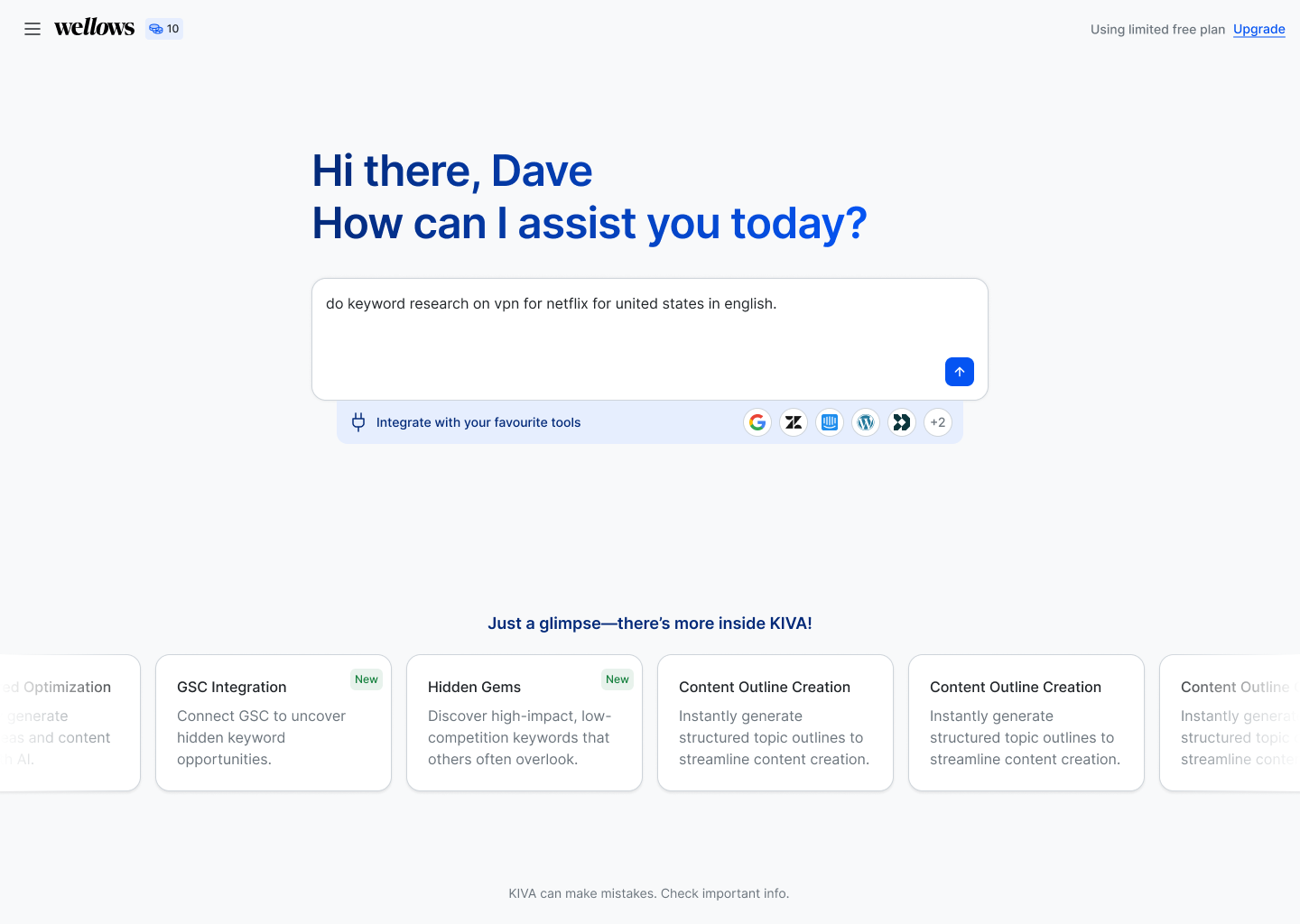
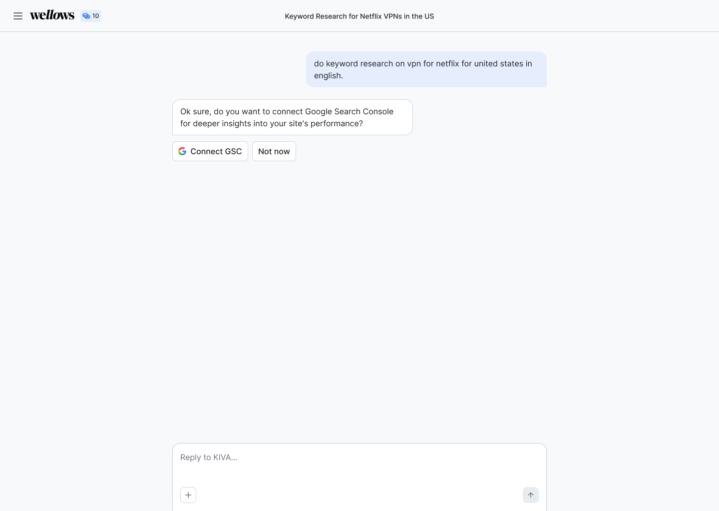
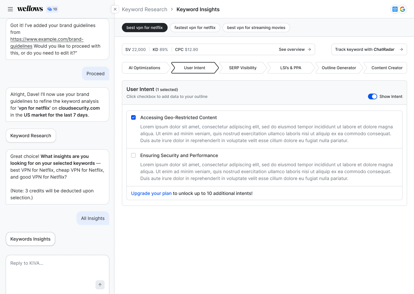
The first version of Wellows was a conversational AI interface — a chat-based UX where users typed natural language queries to get visibility data and keyword insights. It worked technically. But it failed the user.
"We were asking users to learn a new behaviour in a tool they needed to trust immediately. It wasn't working."
New users onboarded into our Slack community consistently showed the same confusion: they didn't know what to ask, they didn't know what the tool could do, and they weren't sure if the outputs were what they needed.
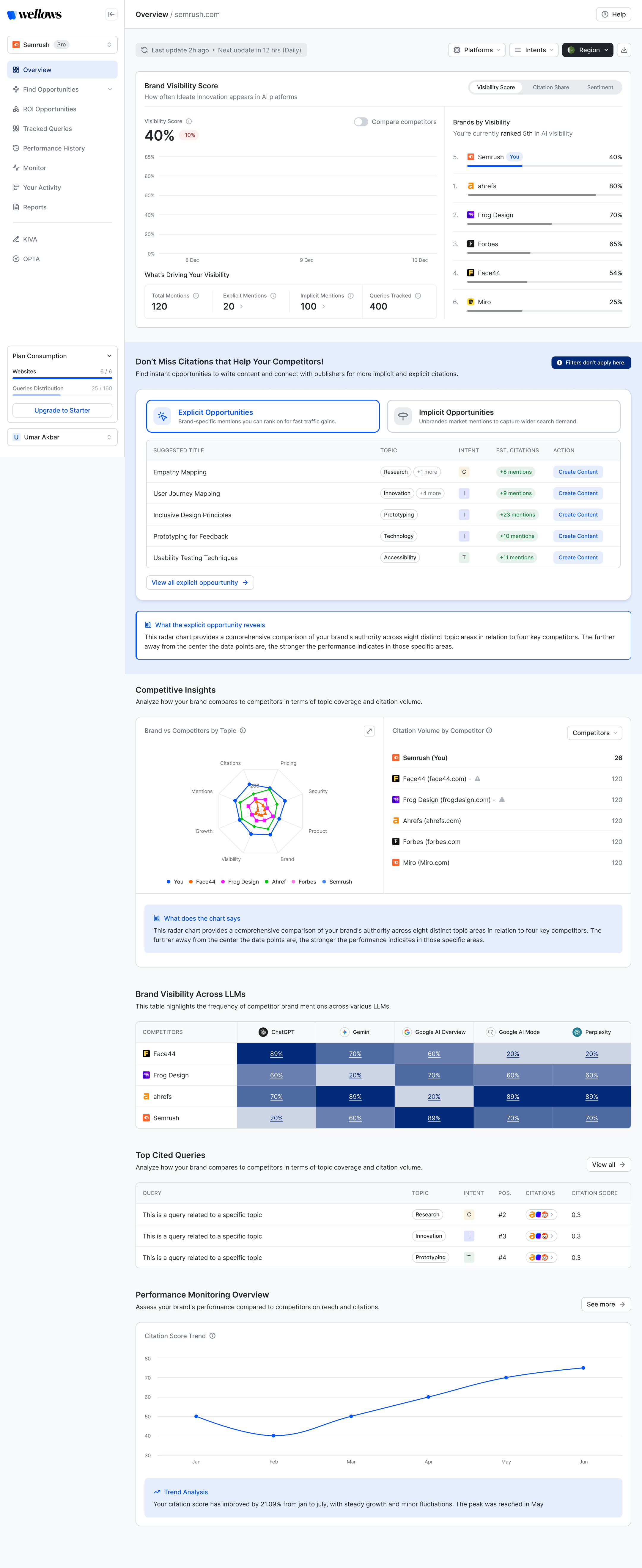
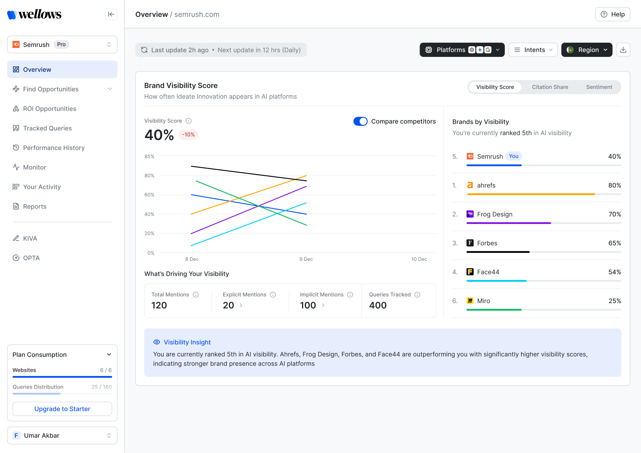
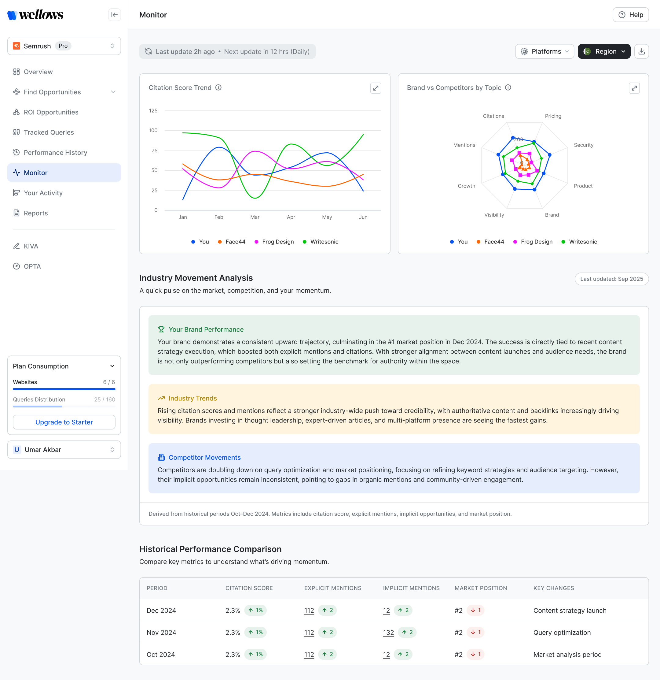
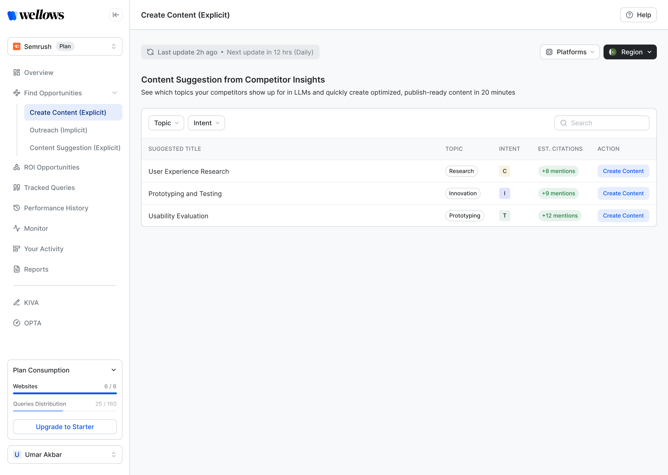
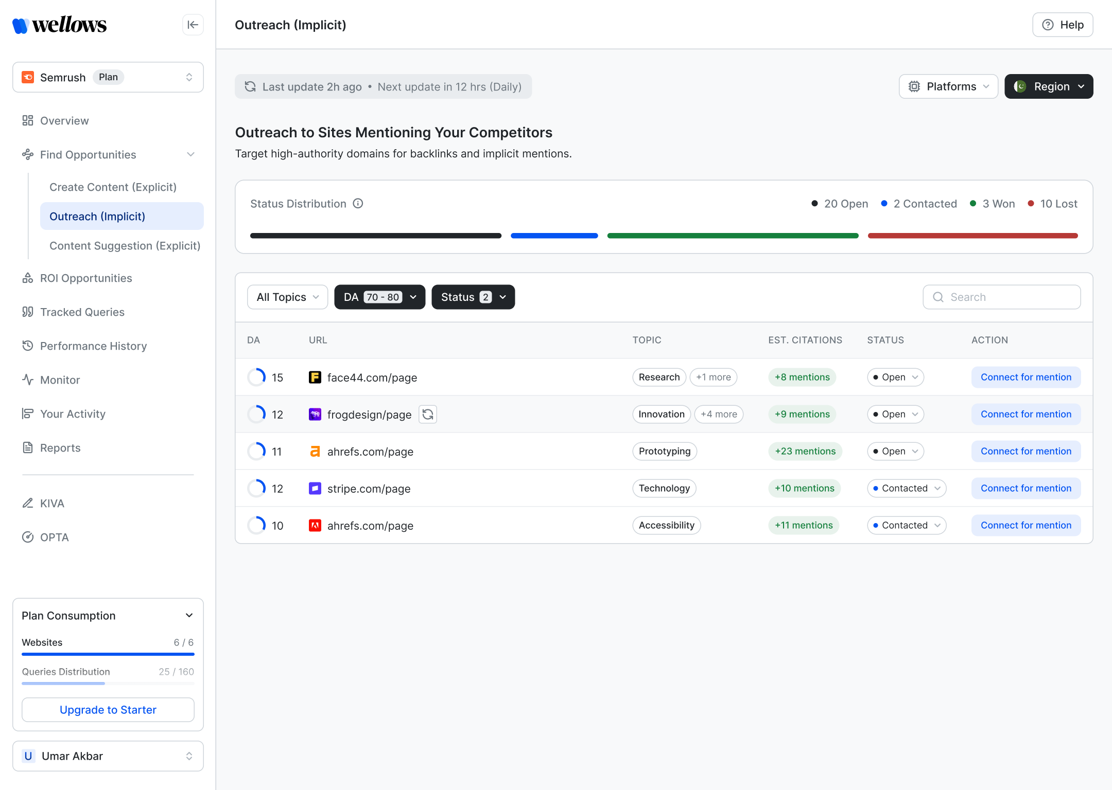
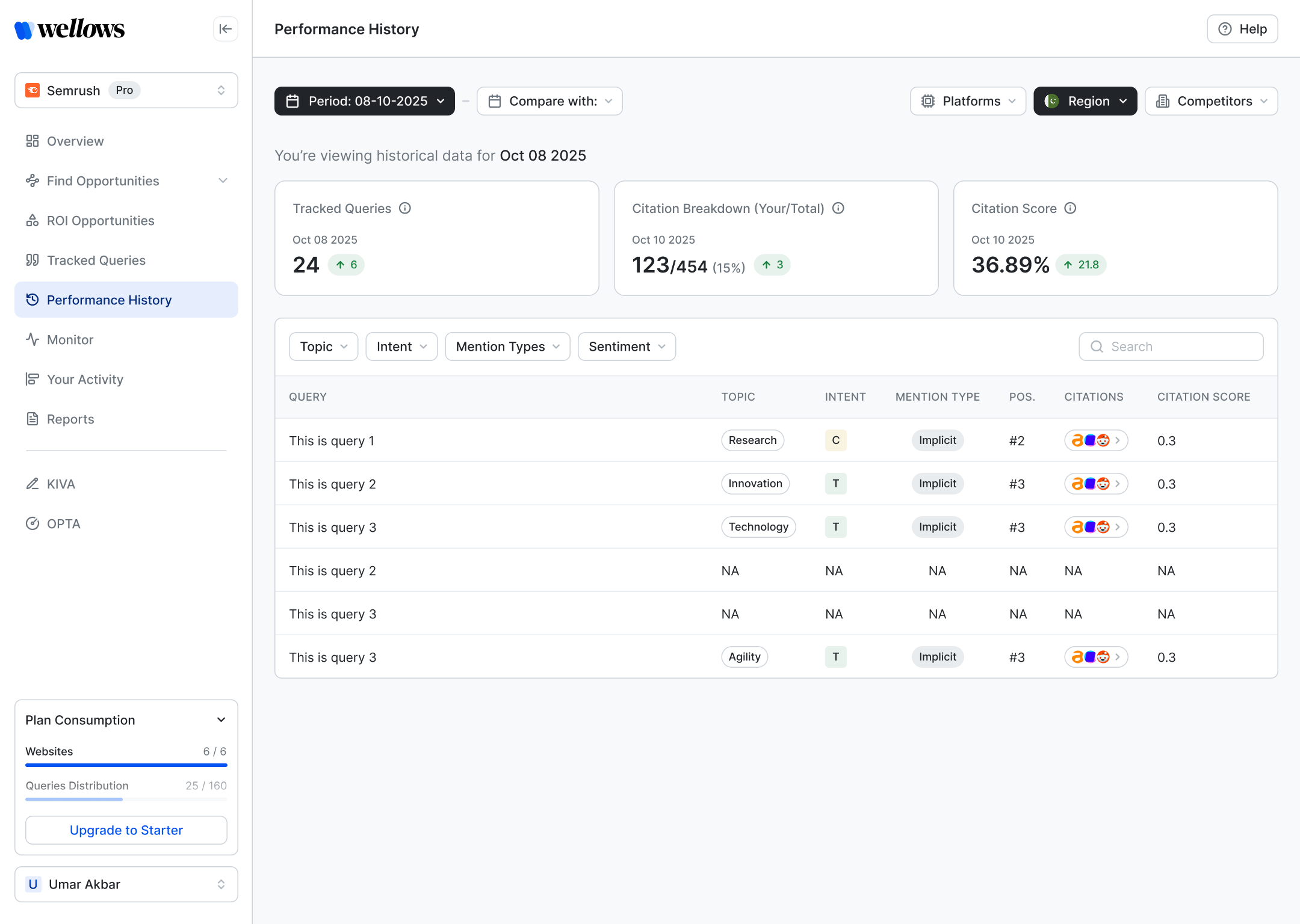
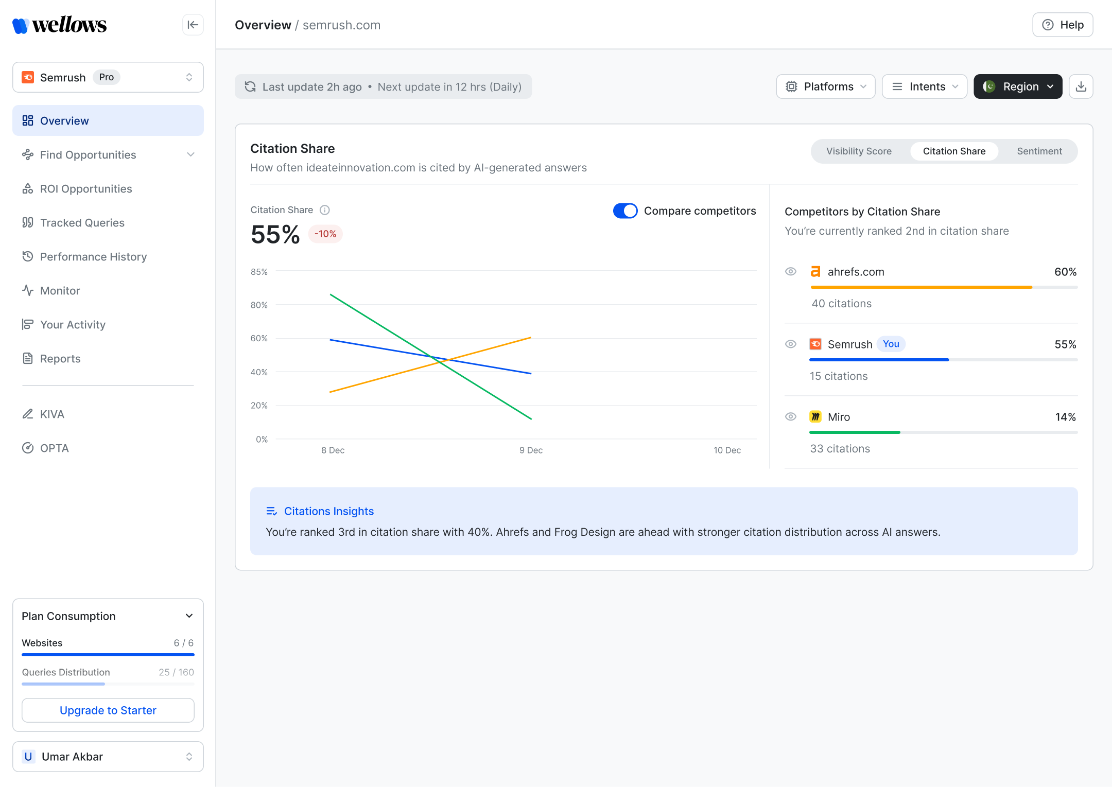
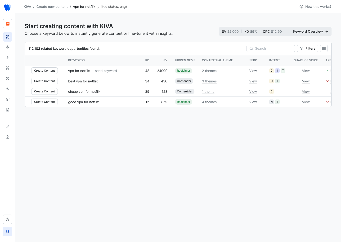
Meanwhile, the competitors entering the GEO space were all converging on structured dashboards — the visual grammar that SEO professionals already trusted. We were creating cognitive overhead where the category needed clarity.
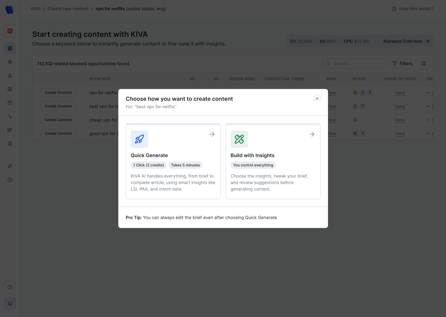
After monitoring how real users interacted with the product and surveying competitor positioning, I presented a clear case: users in this category navigate by scanning dashboards, not conversing with agents. The decision to rebuild was made with full alignment.
The new direction borrowed the visual grammar of Semrush and Ahrefs — not their aesthetic — as a cognitive anchor for users already trained on those tools, then pushed further with a cleaner, more focused data architecture.
The dashboard was designed around a core workflow: understand where you stand, identify what to fix, take action, then track what changed. Every module maps to one of these four stages.
The Visibility Score screen breaks down the headline metric into constituent drivers — total mentions, explicit mentions, implicit mentions, and tracked queries — giving users a causal chain, not just a number.
The Monitor screen was one of the more complex design problems: combining a trend chart, a radar chart for topic positioning, and an AI-generated narrative analysis — without it feeling like a data dump.
The solution was clear sectioning with strong typographic hierarchy, and keeping the AI-generated insight cards collapsible and colour-coded by type: brand performance, industry trends, competitor movements.
The platform distinguishes two types of opportunity: Explicit (content topics your competitors rank for — you should write about them) and Implicit (high-authority sites already cited by LLMs — you should get mentioned there). This distinction needed to be structurally clear, not buried in labels.
Performance History and Citation Share are the screens agencies bring to client presentations. The design needed to communicate trend, comparison, and delta — clearly, at a glance, without requiring explanation.
KIVA is the content generation module — an integrated keyword research and content creation tool. It needed its own distinct visual language inside Wellows because the interaction model is different: more exploratory, keyword-led, with a multi-step creation workflow.
Every decision in the product traces back to a structured design system — tokens, component patterns, and typographic rules that ensure consistency across a product that spans 10+ feature modules and continues to grow.
Designing an ongoing SaaS product over two years is different from a one-off project. The process is iterative, informed by live user signals, and always balancing shipping speed with design rigour.
Two years into a single product is a different kind of design education. You see the full arc — what you got right early, what needed to be undone, and how a product grows when design decisions compound over time.